Paper Plane Therapeutics
July 2021 - April 2022
Therapeutic VR Experiences
Role: User Research, Road Mapping, Wireframes, UI Design, Pitch Deck and Printed marketing assets.
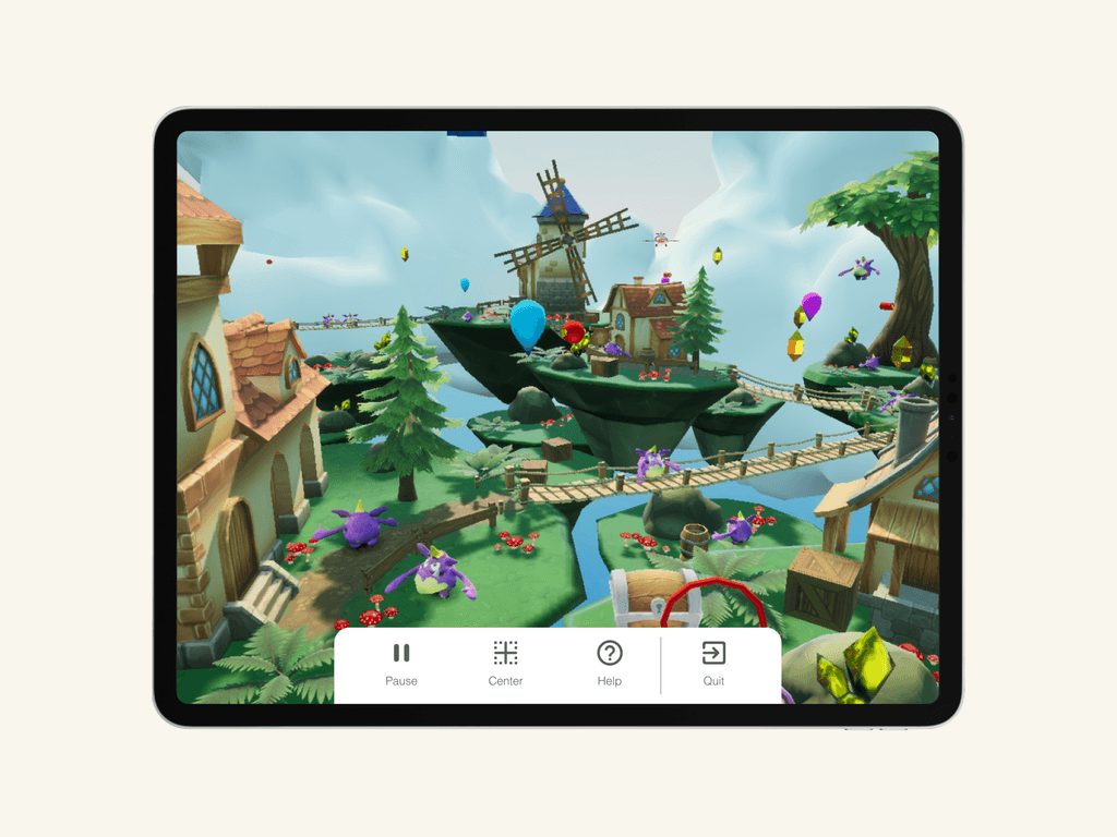
Overview: PaperPlane Therapeutics creates VR games to ease pain and anxiety in children during medical procedures. With two live games, Dream (ages 5-17) helps manage pain during procedures like broken bones or vaccinations, while Imagine aids kids during MRI sessions. These immersive games enhance procedure quality by minimizing sudden movements and alleviating patient anxiety.
Success and Evolution: While collaborating on this project, we had an amazing opportunity to partner with the Quebec vaccine rollout for children, launching our campaign successfully and gaining valuable usage insights.
Working with a startup in its infancy was a significant learning experience, teaching me the importance of prioritizing energy and efforts effectively.
Key Takeaways:
Understand user pain points to develop effective solutions.
Prioritize key features for your Minimum Viable Product (MVP) in startup environments.
Prioritize iteration over perfection, particularly in UI design, focusing on UX solutions for continual improvement.
Setting the Scene
Problem Space:
Recognized nurses' busy schedules and importance of seamless tablet integration.
Tablet user experience had too many touchpoints, which interfered with workflow
There was no branded user guide that helped nurses and technicians set up the tablet and VR set
Our Goal:
Develop simple, user-friendly experience for nurses and technicians
Create new tablet menu
Create components
Create branded user guide
Researching the problem
Stakeholder Interviews: Upon starting the project, I talked with the founders to clarify who the user was and understand their pain points. From these conversations, I discovered that the
Paper Plane Therapeutics customer is someone who is:
Busy
Data-driven
Helpful
User Interview: To initiate our research, I engaged with clinical research coordinators at Shriner Hospital in Quebec. They provided essential information, enabling a deeper understanding of the problem and guiding the search for a solution.
Defined Problem Statement: To seamlessly integrate the VR headset and tablet into the workflow of busy nurses and technicians, the process must be streamlined and non-disruptive to their workflow.
Discovering and Designing the Solution
Usability Test: After consulting with clinical research coordinators at Shriner Hospital in Quebec, I identified several user actions within the current tablet user experience that significantly impacted load times, consequently disrupting user workflows. To address this issue, I deconstructed the user flow into distinct steps to pinpoint areas for improvement visually. This breakdown not only guided the identification of the Minimum Viable Product (MVP) but also provided clear direction for enhancing the overall user experience.
Wireframe: I utilized a tool called Figma for creating wireframes. I developed six distinct wireframe options, each with varying focuses derived from the desired user features.
Ideating and Developing the Product
Goal: Redesigned a menu and home page on the tablet that integrates the VR headset. Reduced tablet pop-ups to ensure seamless and uninterrupted workflow efficiency for nurses and technicians.
UI Kit: I developed a UI kit encompassing visual styles, components, and usage guidelines tailored to our company's needs. This kit streamlined our design process, fostering efficiency and enabling ongoing platform evolution while maintaining visual coherence. It serves as a comprehensive toolkit for our internal design and development teams, empowering them to elevate the platform with consistent styles and elements.
The Final Product
Branding
Pitch Deck Design:Creating the pitch deck for PaperPlane Therapeutics marked my initial exploration into defining the company's brand identity. While initially challenging, clarity emerged as I delved deeper into the company's narrative. Through numerous iterations and mood boards, I crafted designs that resonated with the CEO and CTO. Currently utilized in investor pitches, the deck serves as a powerful tool for showcasing our vision.
Design Tools: Figma
User Guide Design:Integral to our product offering, the User Guide provides clients with a comprehensive step-by-step overview. Included with every VR headset and tablet package, my task was to present this information in alignment with our brand identity.
Design Tools: InDesign & Figma


