Insights
January 2021 - On going
Peer-To-Peer Marketplace
Role: Product Designer, Visual Design, Prototyping & Testing
Overview: Introducing Insights: a cutting-edge web platform designed to provide users with comprehensive insights on their areas of interest. While traditional blog posts may fall short in addressing specific queries, Insights steps in to offer direct answers to direct questions. The goal is to streamline research efforts, foster networking opportunities, and deliver tailored solutions promptly and effectively to meet users' unique needs.
Key Takeaway:
Ensure the engineer is engaged at every stage to maintain project clarity and alignment.
Iteration is perpetual; as new insights emerge, your design evolves.
While research time was limited, I recognized its pivotal role in this journey. Overcoming challenges, such as crafting robust user stories, would have been smoother with deeper user insights.
Setting the Scene
Problem Space:
The global pandemic has triggered a significant shift in communication norms. What was once conventional face-to-face meetings has seamlessly transitioned to virtual platforms like Zoom and Google Meet.
People have adapted to conducting meetings and social gatherings online, embracing the convenience and accessibility it offers.
Despite this, the challenge remains in finding meaningful discussions and connections around specific topics of interest.
Our Goal:
Develop a user-friendly platform that facilitates meaningful connections in virtual settings.
Allow users to easily book appointments with mentors on the platform
Researching the problem
Stakeholder Interviews: engaged with the founders to discuss the user persona and delve into their pain points. Through these discussions, it emerged that the Insights user demographic comprises newly graduated individuals seeking:
Mentorship opportunities
Networking avenues for industry insights
Seeking community
Defined Problem Statement: In a post-pandemic world where virtual communication has become the norm, there remains a challenge in facilitating meaningful interactions and connections around specific topics of interest.
Discovering and Designing the Solution
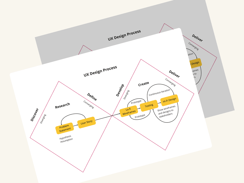
Usability Test: After thorough consultation with the founding team, it was determined that the platform should prioritize simplicity, allowing mentors to easily showcase their availability for booking while ensuring a seamless experience for mentees. To tackle this challenge, I meticulously dissected the user flow into discrete steps to visually highlight areas for enhancement. This breakdown not only facilitated the identification of the Minimum Viable Product (MVP) but also furnished clear directives for refining the overall user experience.
Wireframe: I used Figma as my tool of choice to craft wireframes. Within this platform, I generated six unique wireframe iterations, each tailored to emphasize different aspects derived from the desired user features.
Ideating and Developing the Product
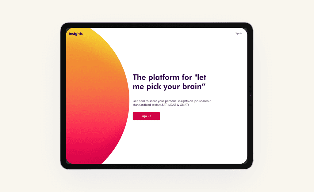
Goal: The website design underwent numerous iterations before reaching its current appearance. The focal point of the platform is a semicircle displayed on the screen. After conducting readability tests on the page content, feedback indicated that most users found it difficult to read. To address this issue, we opted to remove any text from the semicircle, relocating it to the left side of the screen. This decision not only lends the website a distinctive aesthetic but also ensures accessibility for users.
The Final Product
UI Kit: Creating the design kit facilitated a cohesive visual direction for the team, ensuring consistency across the platform.


